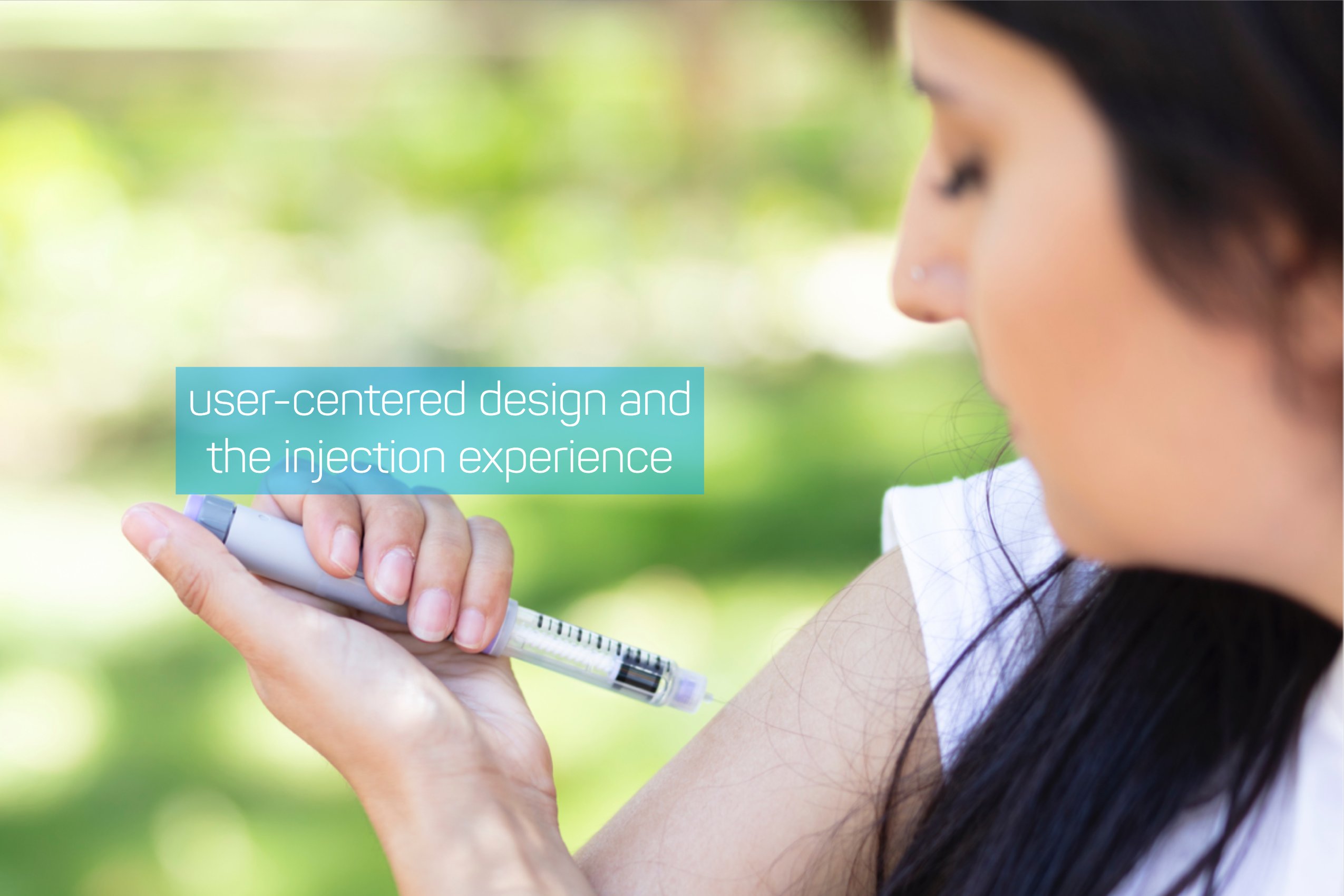
When you have insulin-requiring diabetes, taking insulin becomes part of your daily routine, but there’s really nothing routine about it. Since insulin doesn’t necessarily have a fixed dose or timing, the burden is on you to decide how much to take, how often, and how to time your doses in relation to your meals or glucose fluctuations. In deciding how much to take, you have to factor in your glucose values - whether your glucose is in range or whether it’s slowly changing or rapidly rising or falling. And you have to think about your activity level, the amount and types of food in front of you, how much insulin may still be working in your body from your last dose, and what happened the last time you took this dose.
If you’re like me, instead of a plate of food in front of you, you see a math equation composed of carbohydrates, fats, proteins, carbohydrate ratios, current glucose, and future activity. You might have dosing instructions written on a crumpled piece of paper, or maybe it’s checkboxes in your brain, but it’s a lot of attention to detail required for something you have to do several times each day.
Given the amount of mindspace that people with diabetes have to give up when it comes to insulin dosing, anything that would make the dosing experience easier to navigate could bring real relief. Enter User-Centered Design - a design principle which involves creating solutions with the end user’s needs front and center, observed by seeing how people who are actually living with the problem do things in their normal day. What if we could reimagine the whole workflow of taking an insulin injection?
Considering the Process
Insulin can be delivered in a number of ways - syringe, insulin pen, insulin pump, or even inhaled - but syringes and insulin pens are the most commonly used ways of dosing insulin. Because pens and syringes are not connected or intelligent, however, we have had to use apps and calculators if we want to get the math out of our heads and into our insulin pens. In the past few years, we’ve seen a number of helpful, intelligent apps come to market that allow users to enter dosing information into the app, thereby keeping a log of their diabetes information, but in many ways, these apps add more work for us, asking us to manually enter our dosing data, engage with yet another thing, pull one more object out of our pockets. Though it might help us with the math of a dose, it doesn’t actually make life any easier for most of us.
At Bigfoot, we’re taking note of what a person’s current injection process actually looks like. If you’re dialing up a dose on your pen, changing and/or priming a pen needle, prepping your skin - the last thing you’re interested in doing is manually logging numbers into your phone. Who has that many hands? Our solutions in development are being designed with the intent to give you information in the flow of what you’re already doing, meeting you where you already are. No more steps. Simple.
Remembering When Your Last Dose Was
When we asked our community of followers if they ever had trouble remembering whether or not they took a dose, 93% reported having trouble remembering! This problem was why I created Timesulin®, a timer cap for disposable insulin pens, first for myself and now used by hundreds of thousands of people worldwide. For me, and many others, having the information on the cap I use for my insulin pen was a way to have the time of last dose logged without me having to remember or write it down. I could glance at my cap as I took an injection and have this information available.
I could have created a medication reminder app - there are many great ones available, but that wasn’t a solution that lived in the same place as my problem, so it wouldn’t have been a user-centered solution. When technology is designed with the user in mind, the technology is asked to do more so that the user can do less...and do more with their time and their life.
Today at Bigfoot, we are working to extend this approach to our connected solutions, with the goal to give users peace of mind and to reduce the amount of cognitive and emotional space that diabetes takes - so those of us with diabetes can focus on other things.
User-centered design is at the heart of everything we’re doing at Bigfoot because we know the challenges of diabetes personally. We promise to keep you - what frustrates you, what keeps you going, and what you wish you could change - at the forefront of our solutions as we do the work to bring them to market. Thank you for joining us on that journey.


